Story
Founded more than 40 years ago, Mabat Platinum has established itself as Israel’s premier luxury touring agency, delivering exclusive, high-end travel experiences. From private archaeological tours and gourmet journeys to wellness retreats and adventure safaris, the agency blends impeccable service with authentic cultural immersion. Renowned for its meticulous attention to detail and customized itineraries, Mabat Platinum caters to elite travelers seeking both luxury and a deep connection with Israel’s rich heritage.
Needs
- They are a niche brand that sells to specific audience
- Their messages: luxury, exclusive , VIP service, putting the client 1st no matter what, good reputation
- They don’t have a design guide to work according to at the moment, and want one
- They want to improve their social media presence
Target Audience
The target audience is mainly north America, wealthy audience, families or any other small groups.
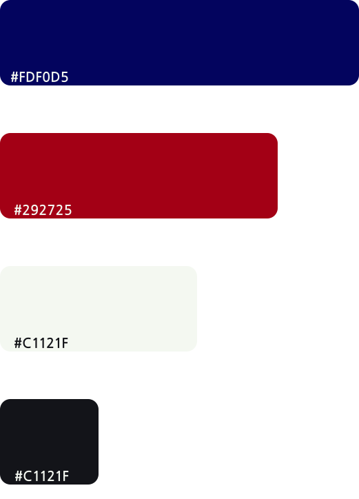
Colors
Logo
The rebranding of Mabat is ment to preserve the image and their already existing presence since 40 years ago.
I wanted to refine the logo and make it look a bit more modern and also create different aerations for them to use.
Old logo:
New logo:
Icon:
Elements
As part of the rebranding process, my goal was to create different graphic elements to use for any of their future designs.
The elements are to represent the logo of the company, which is wheat and globe.
The wheat has a background story in Israel, and has a strong meaning of authenticity of the land.
The globe is to represent the world and traveling, having people come to Israel from all around the world.

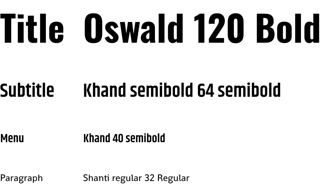
Typography
Mockups & more
You may check the full case here on Figma.
What's next
This was more like a passion project, I hope to work with Mabat and improve it even more according to their preference as well in the future.
Stay In Touch
Drop me a message and we can discuss your needs & expectations.
You can also just say hi ☺️